Learning Analytics

A deep dive into the four types of analytics used to understand and improve learning outcomes. 

I produced data visualizations, reference diagrams, and explainer videos that break down their purpose, methods, and tools.

Descriptive Analytics

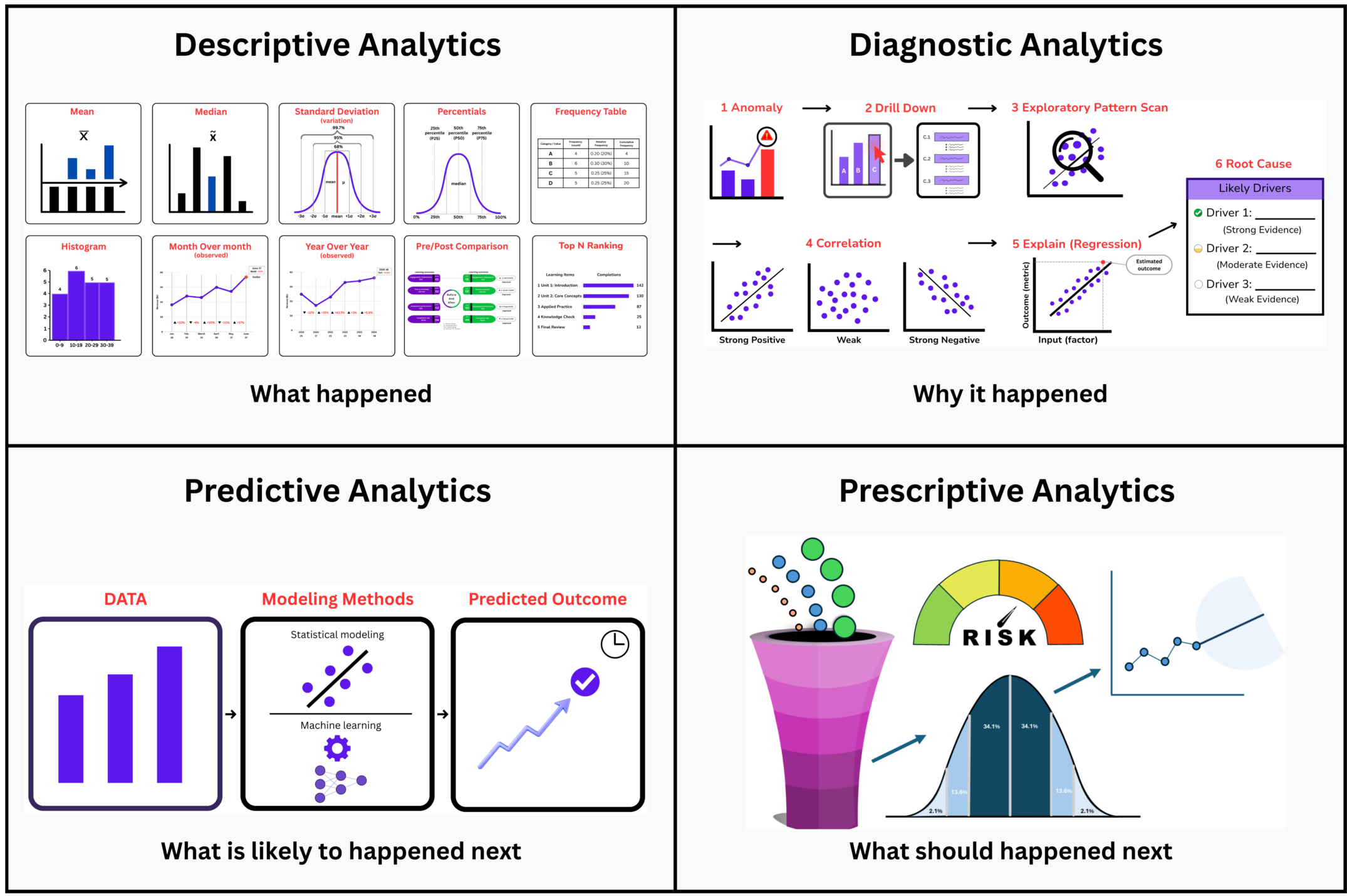
Visualizations and reference materials I created to illustrate how descriptive analytics summarizes past activity using basic measures, visual summaries, comparisons, and dashboards.

Basic Measures

Mean identifies average assessment scores across cohorts.

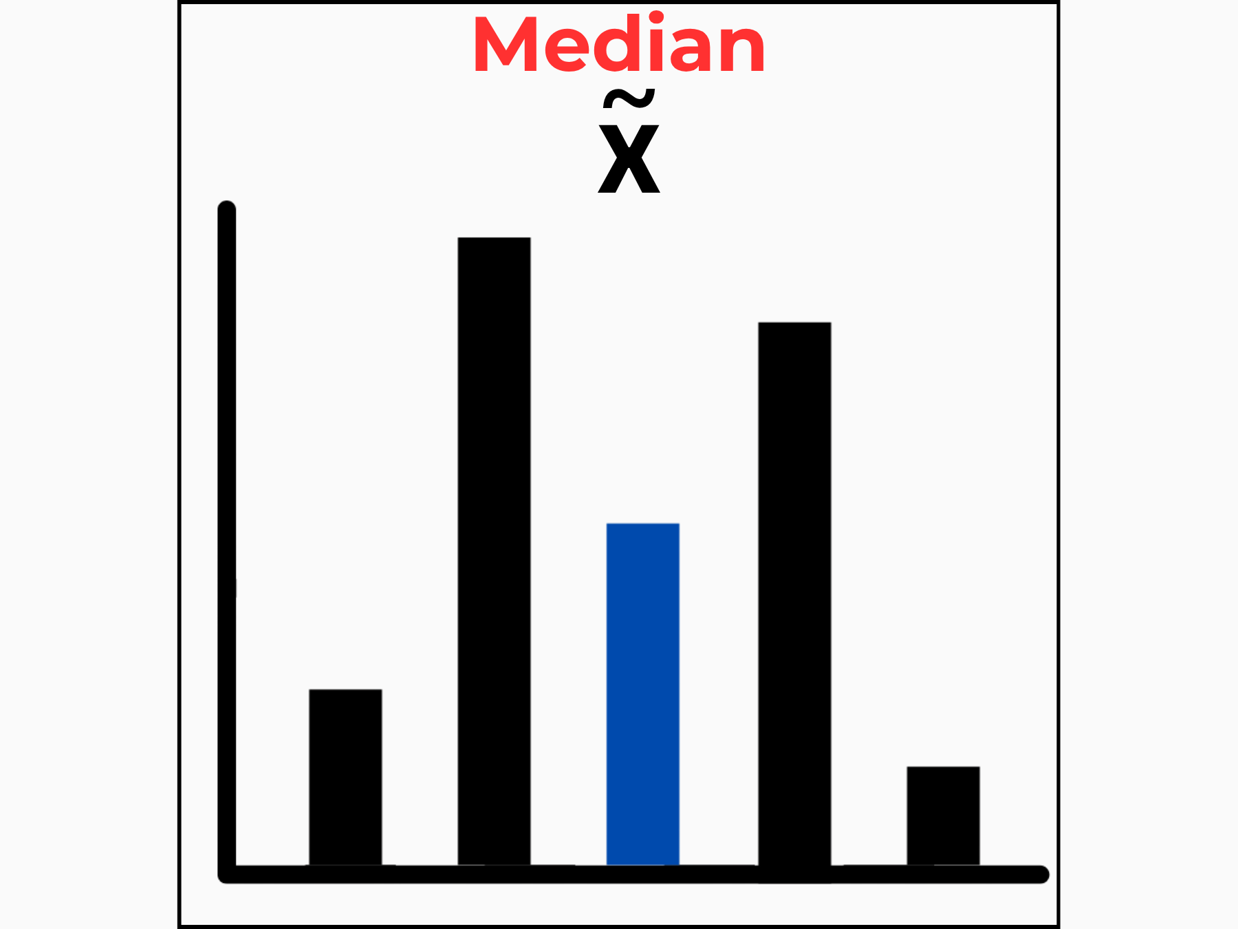
Median provides a more accurate midpoint when outliers skewed results.

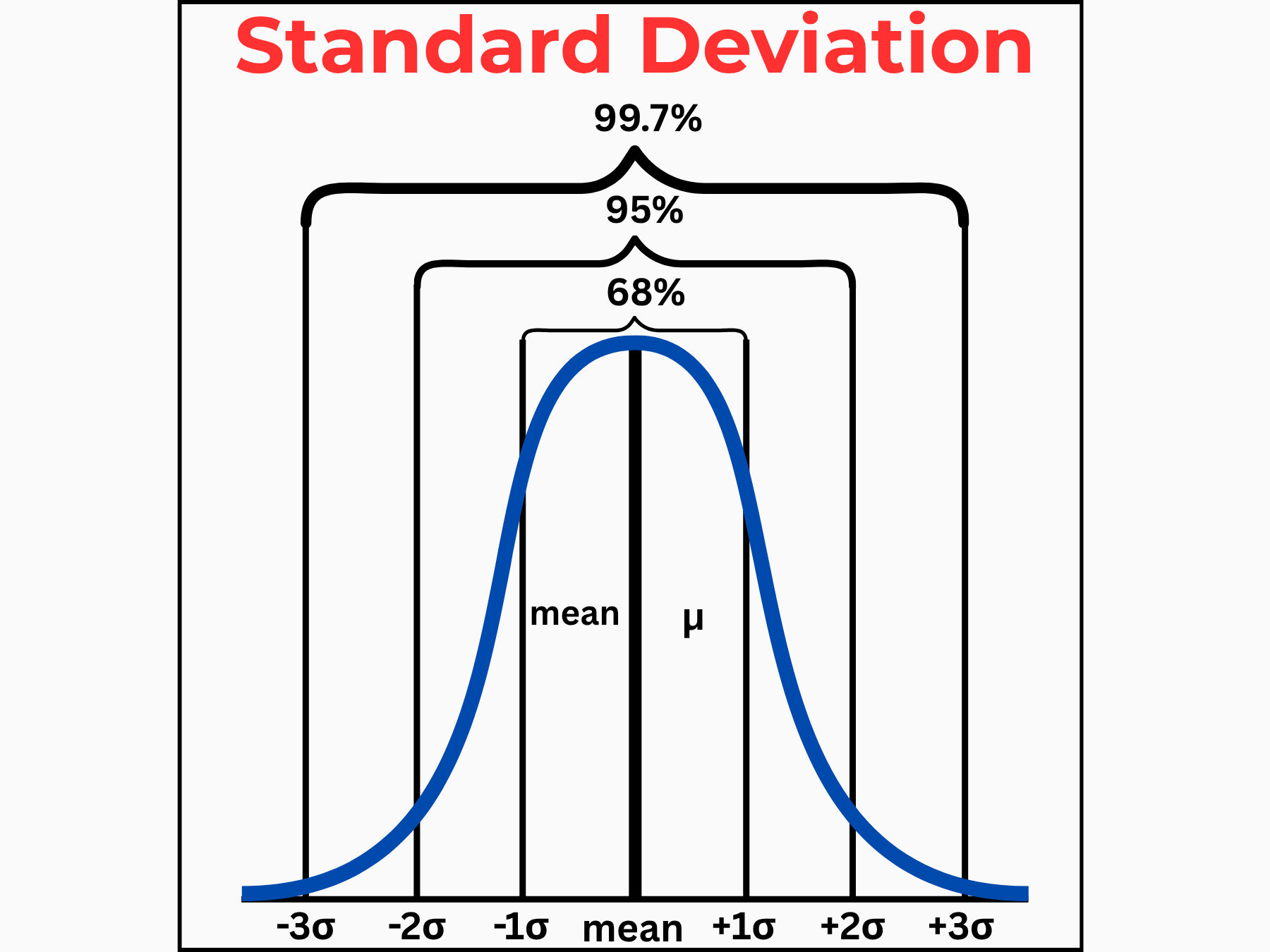
Standard Deviation measures score spread to flag inconsistent learning outcomes.

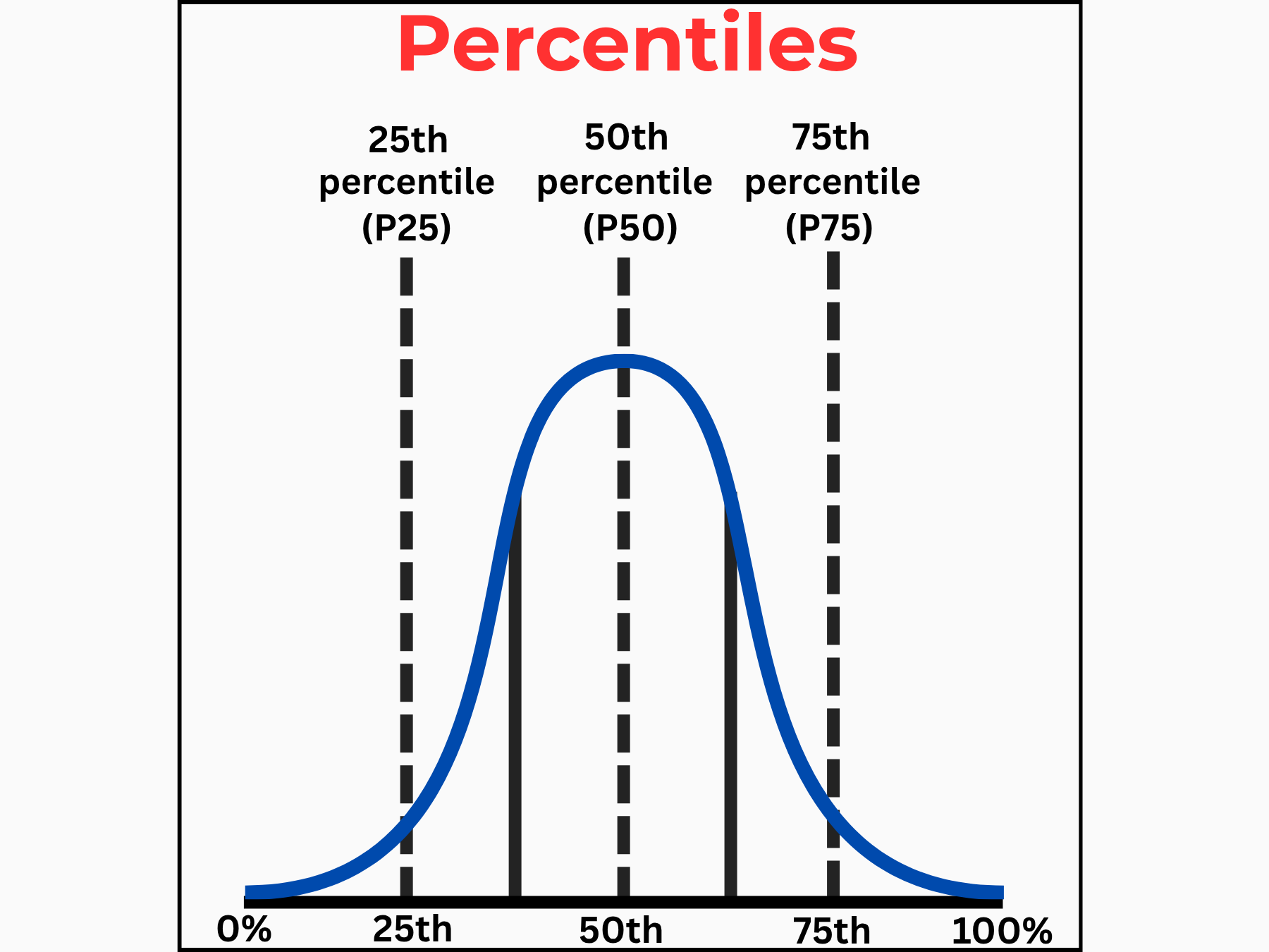
Percentiles ranks learner performance to identify at-risk groups.

Tabular & Visual Summaries

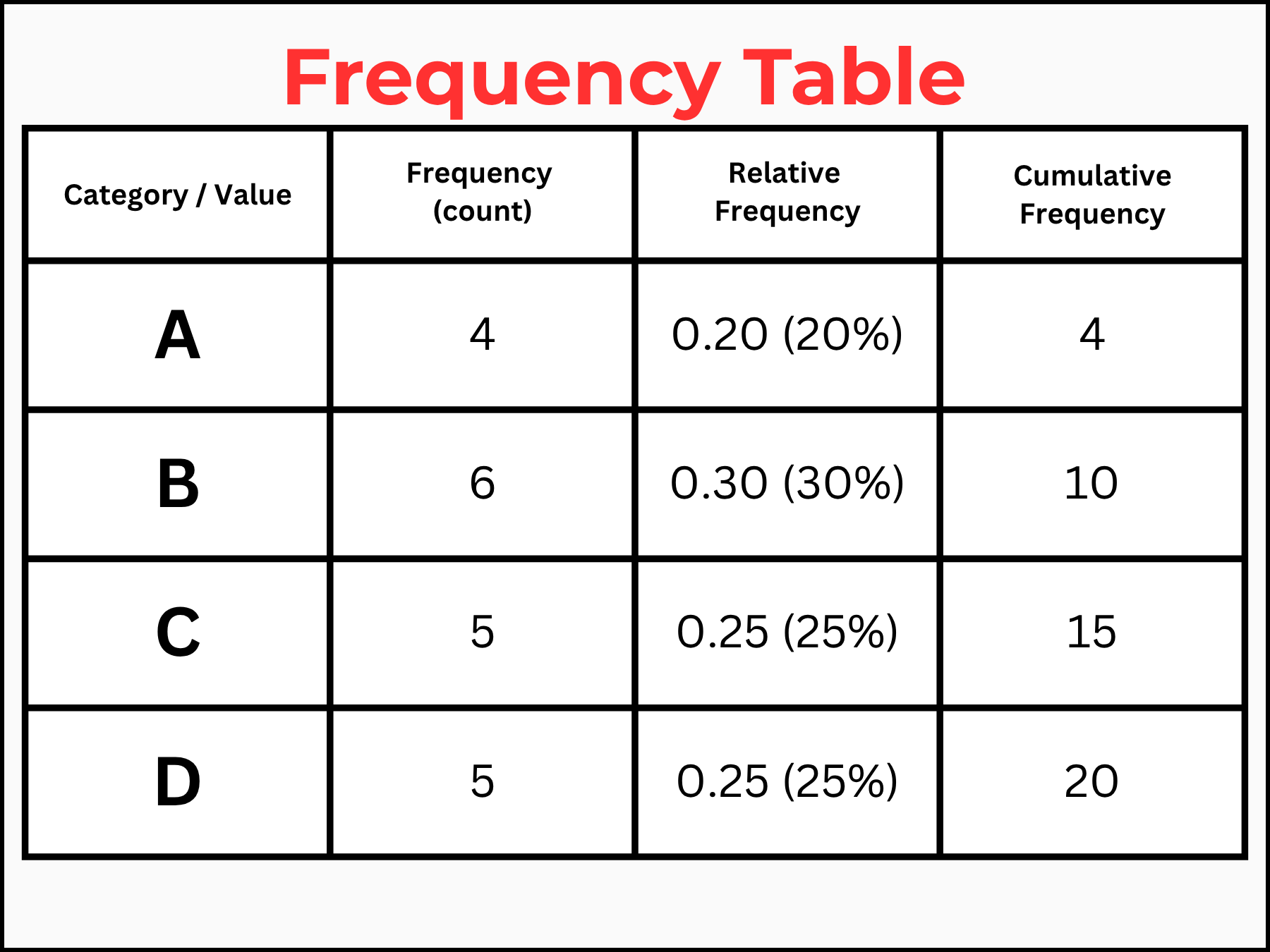
Frequency Table organizes raw data into categories to reveal grade distributions at a glance.

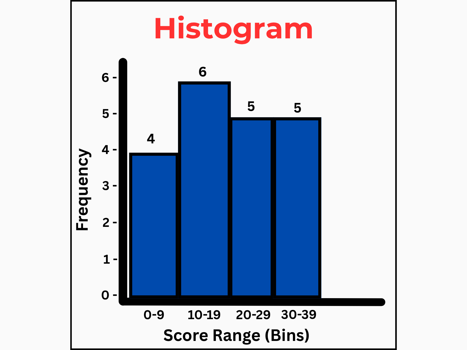
Histogram visualizes score distributions to quickly spot patterns and gaps in learner performance.

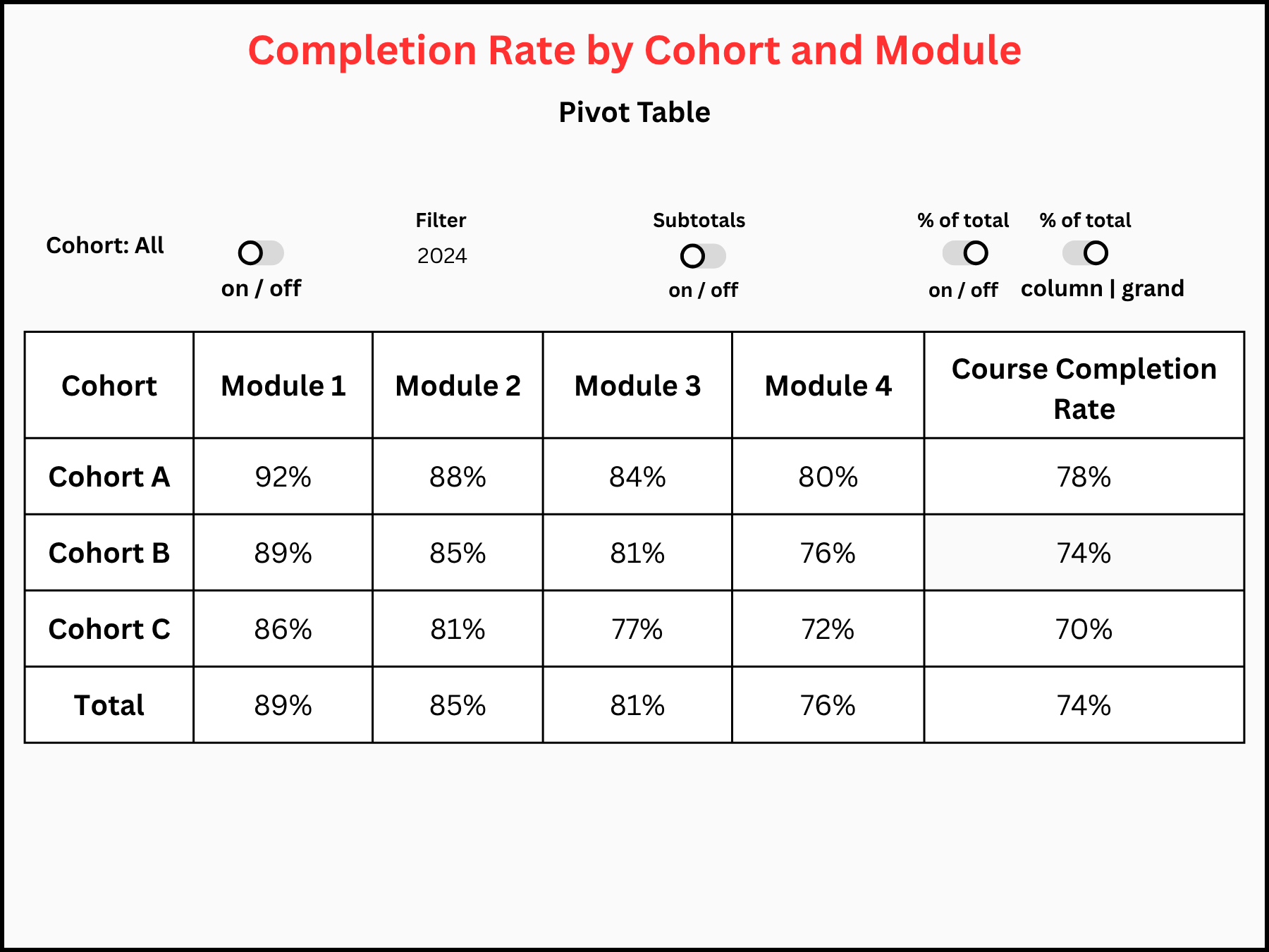
Completion Rate by Cohort and Module uses pivot table analysis to pinpoint where specific cohorts dropped off.

Comparisons & Rankings

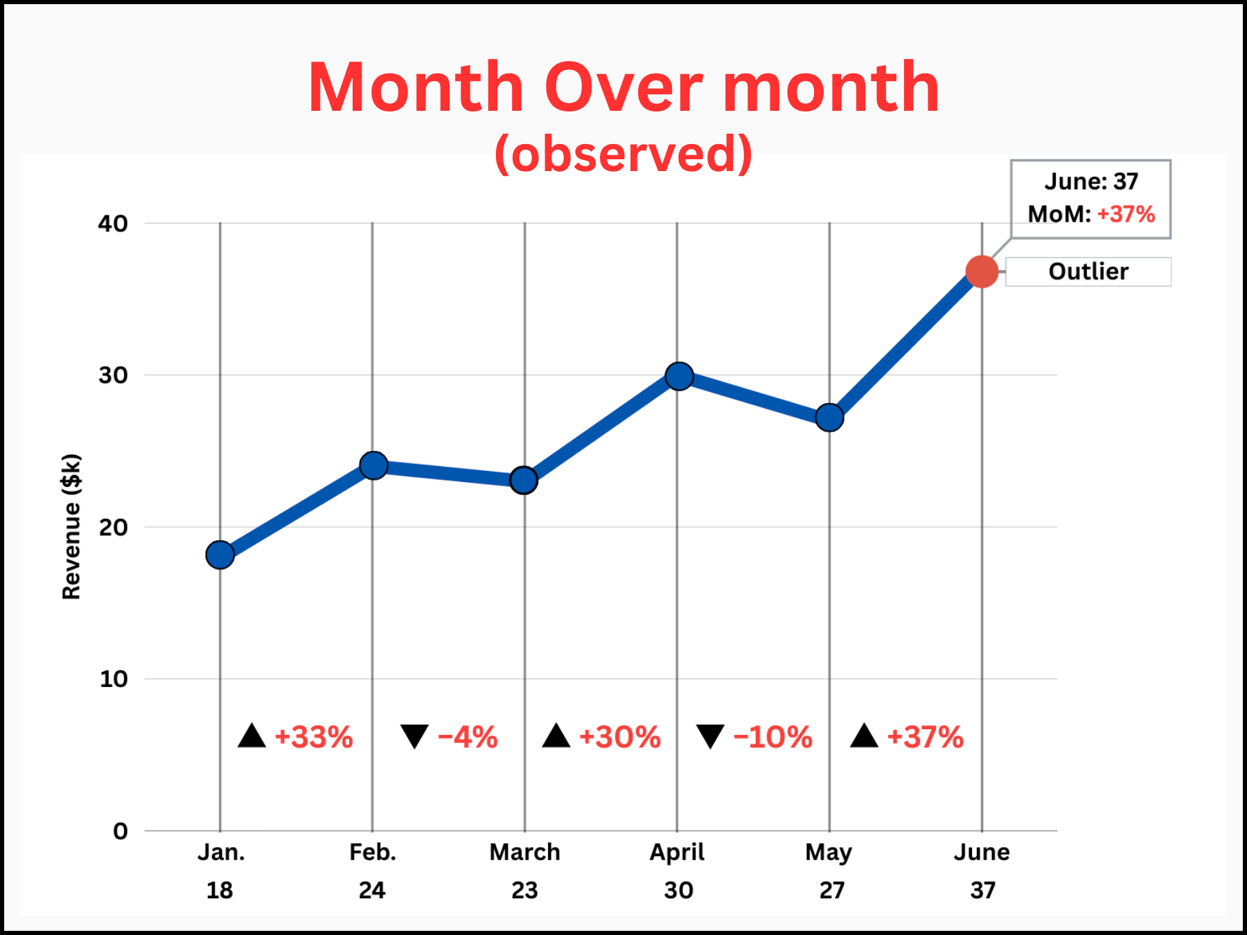
Month Over Month tracks engagement trends over time to identify seasonal drops or gains.

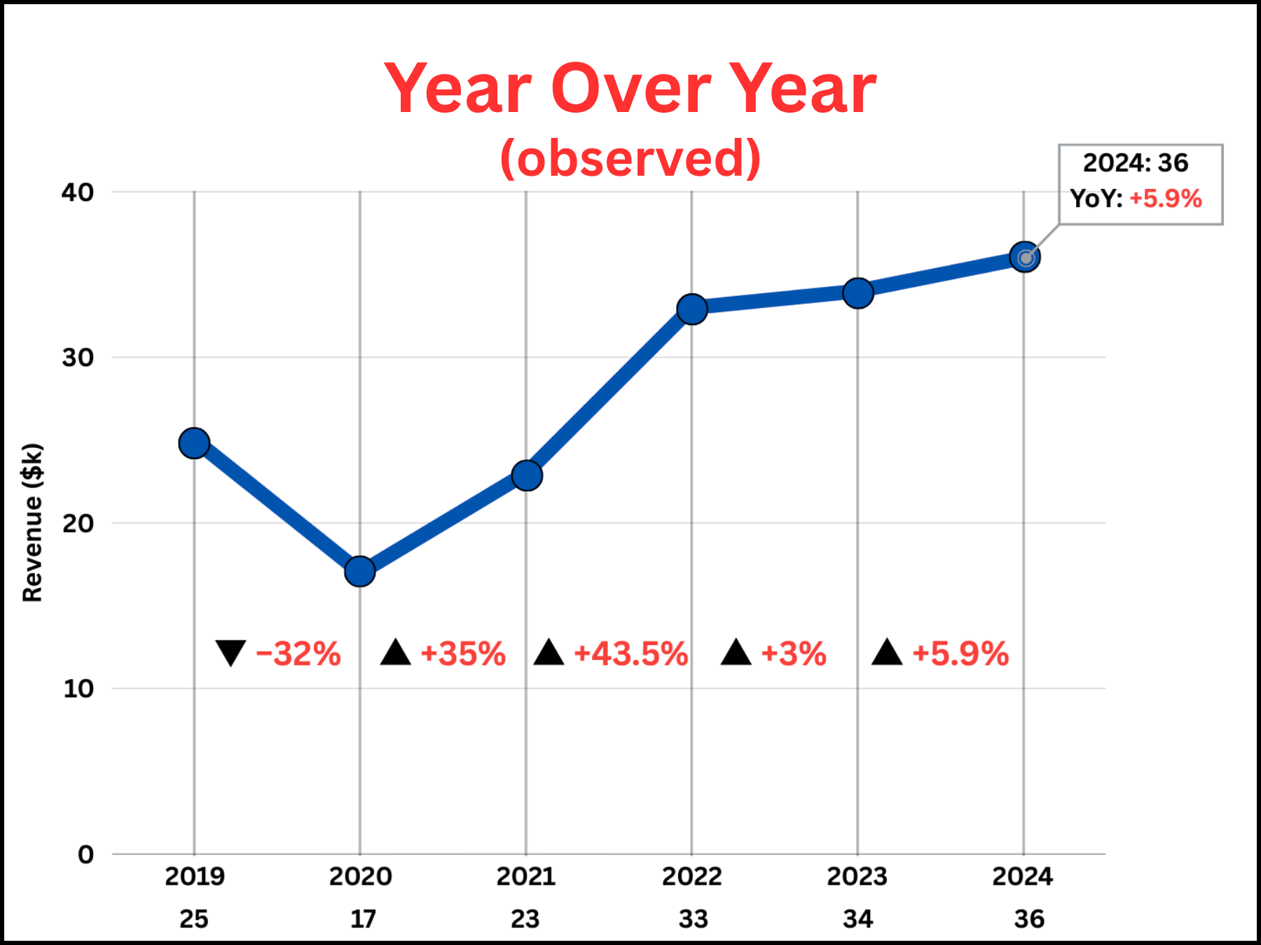
Year Over Year compares annual performance to measure long-term program impact.

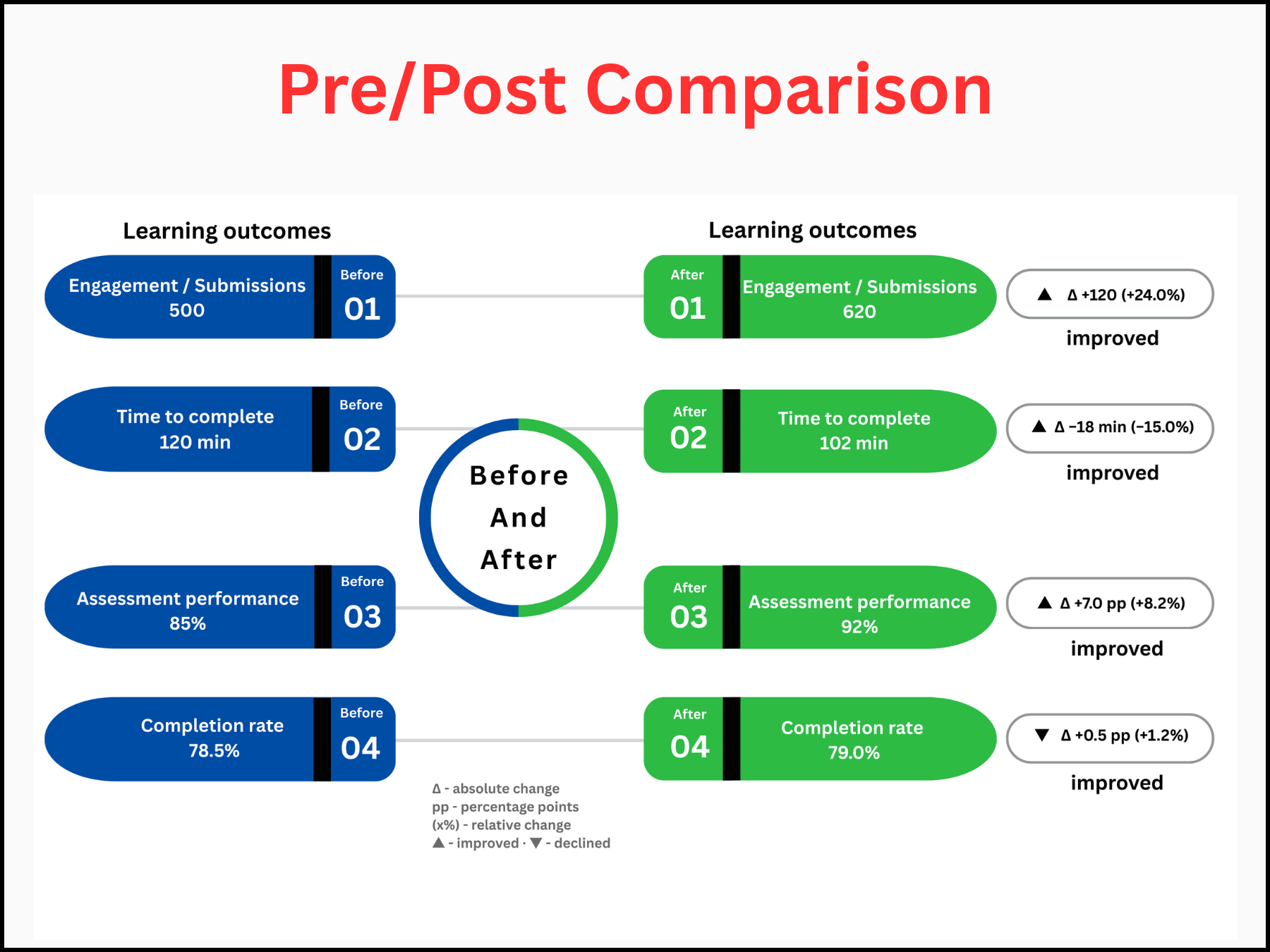
Pre/Post Comparisons measure learning gains by comparing scores before and after training.

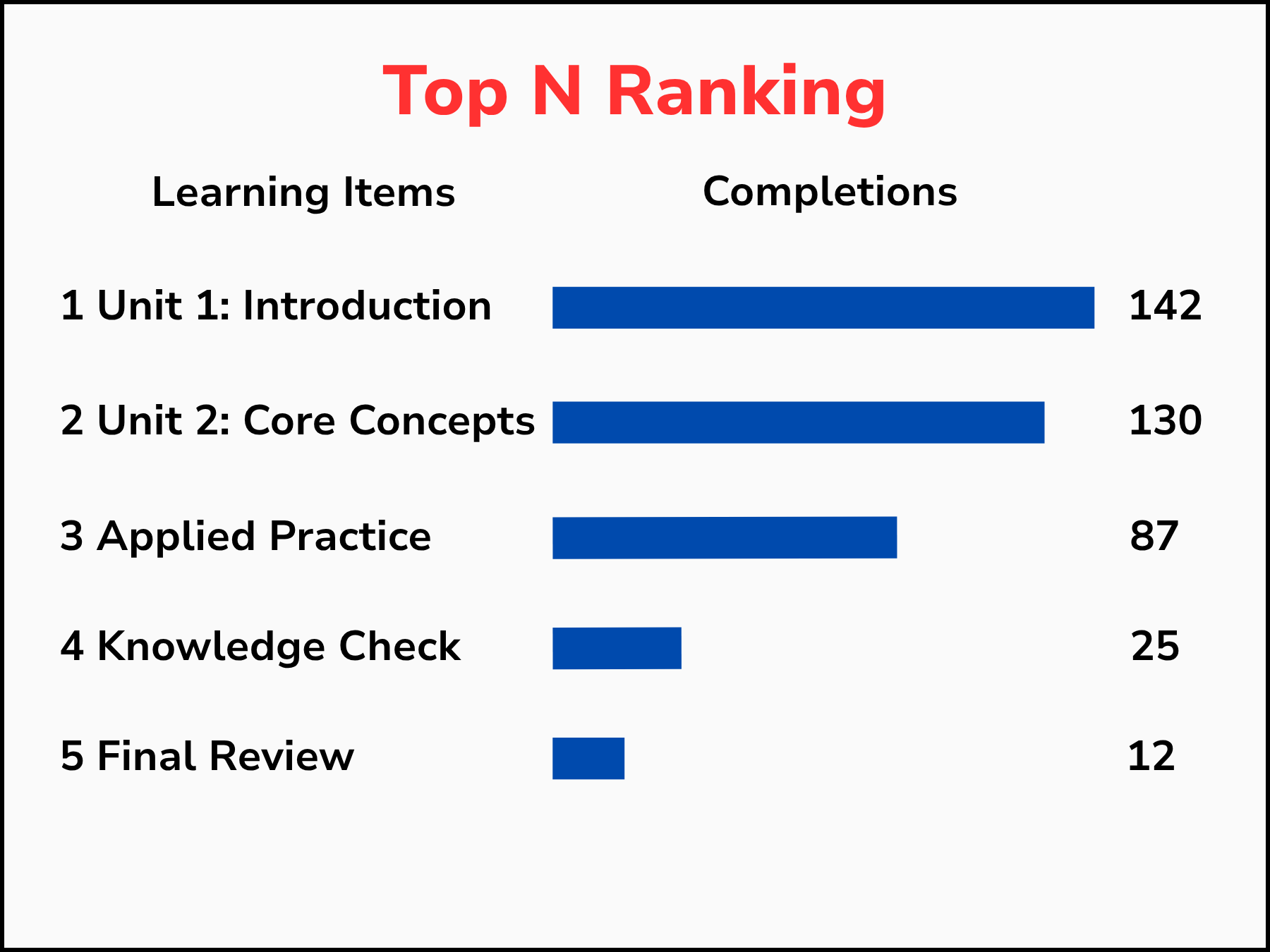
Top N Ranking surfaces the highest-performing content to guide future course design.

Dashboards & Scorecards

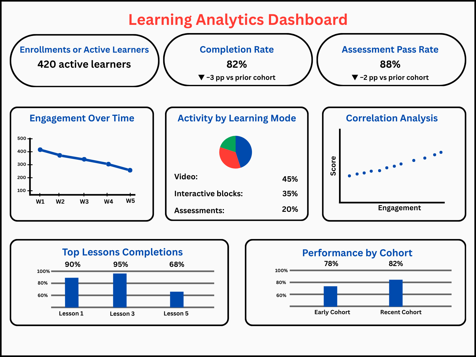
Learning Analytics Dashboard consolidates key metrics into a single view for stakeholders to monitor program health.

Learning KPI Scorecard tracks cohort-level KPIs against targets to flag underperformance early.

Descriptive Analytics Video

Diagnostic Analytics

Diagrams and tool references illustrating how diagnostic analytics explains why outcomes occurred using drill-down analysis, correlation, and BI tools like Power BI and Tableau.

Techniques

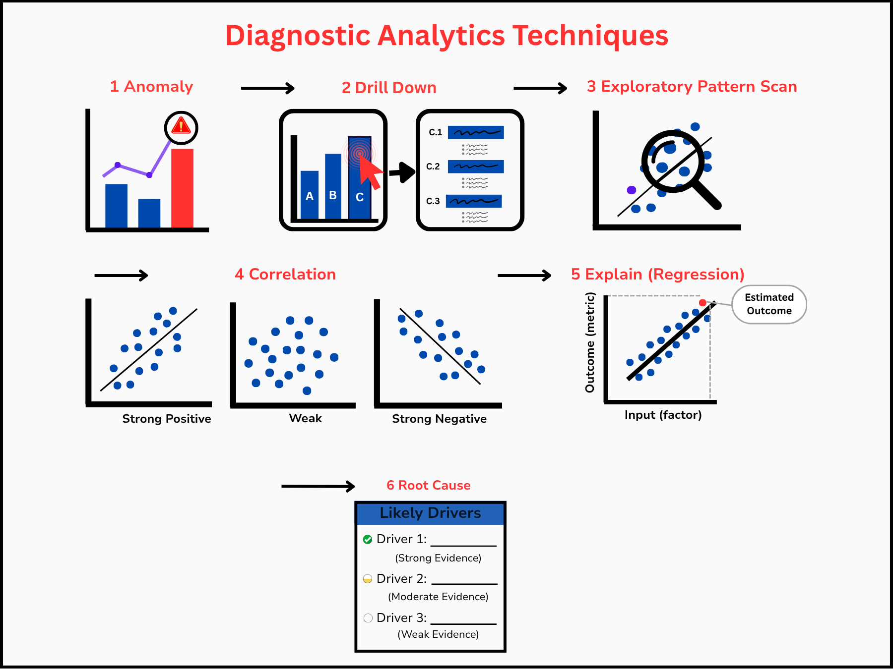
Diagnostic Analytics Techniques illustrates a common diagnostic workflow moving from detecting anomalies to identifying root causes through drill down, pattern scanning, correlation, regression, and driver analysis.

Tools & Views

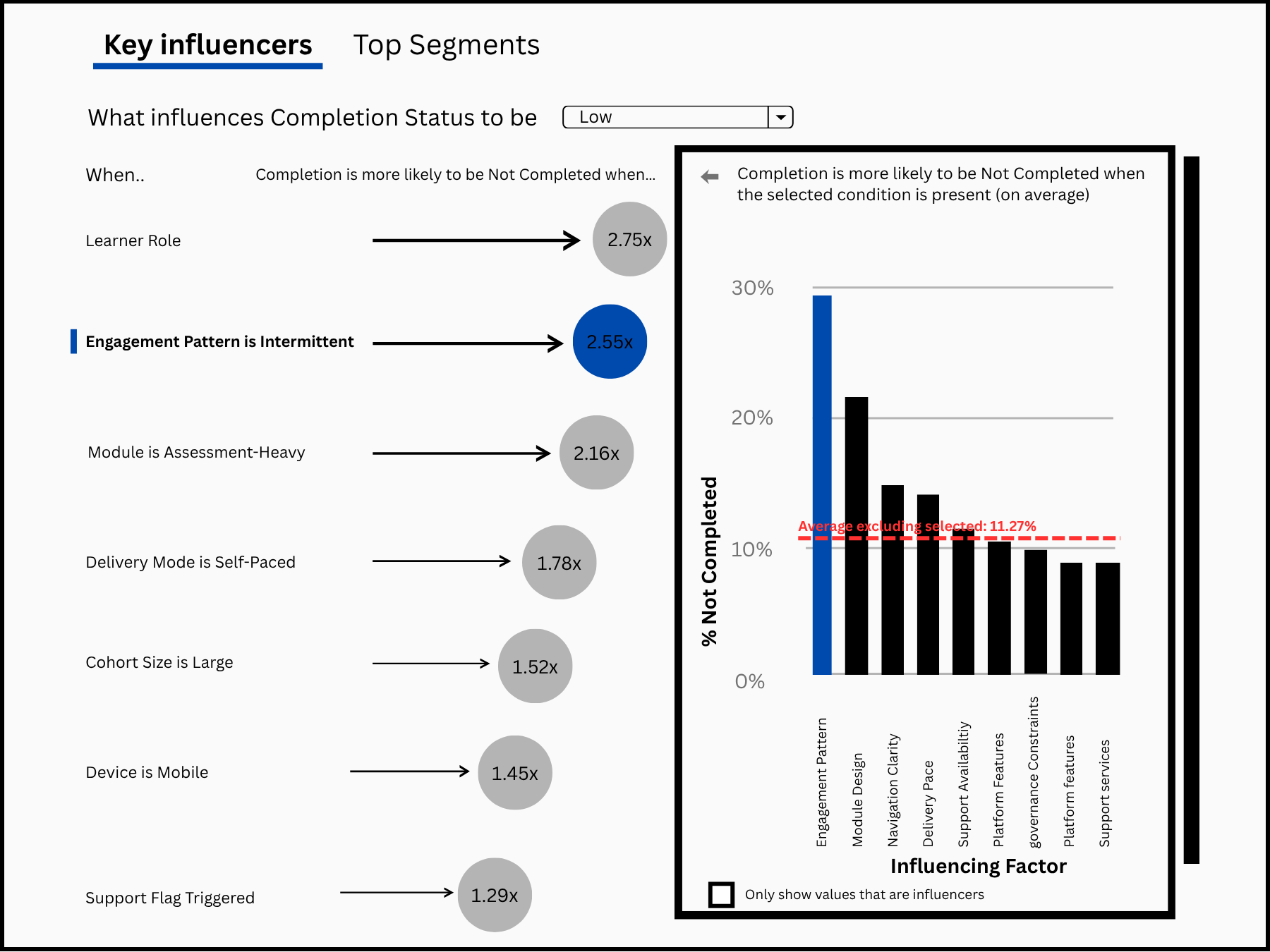
Key Influencers uses Power BI to surface which factors are most likely to increase the low completion rate, ranking each by strength of influence.

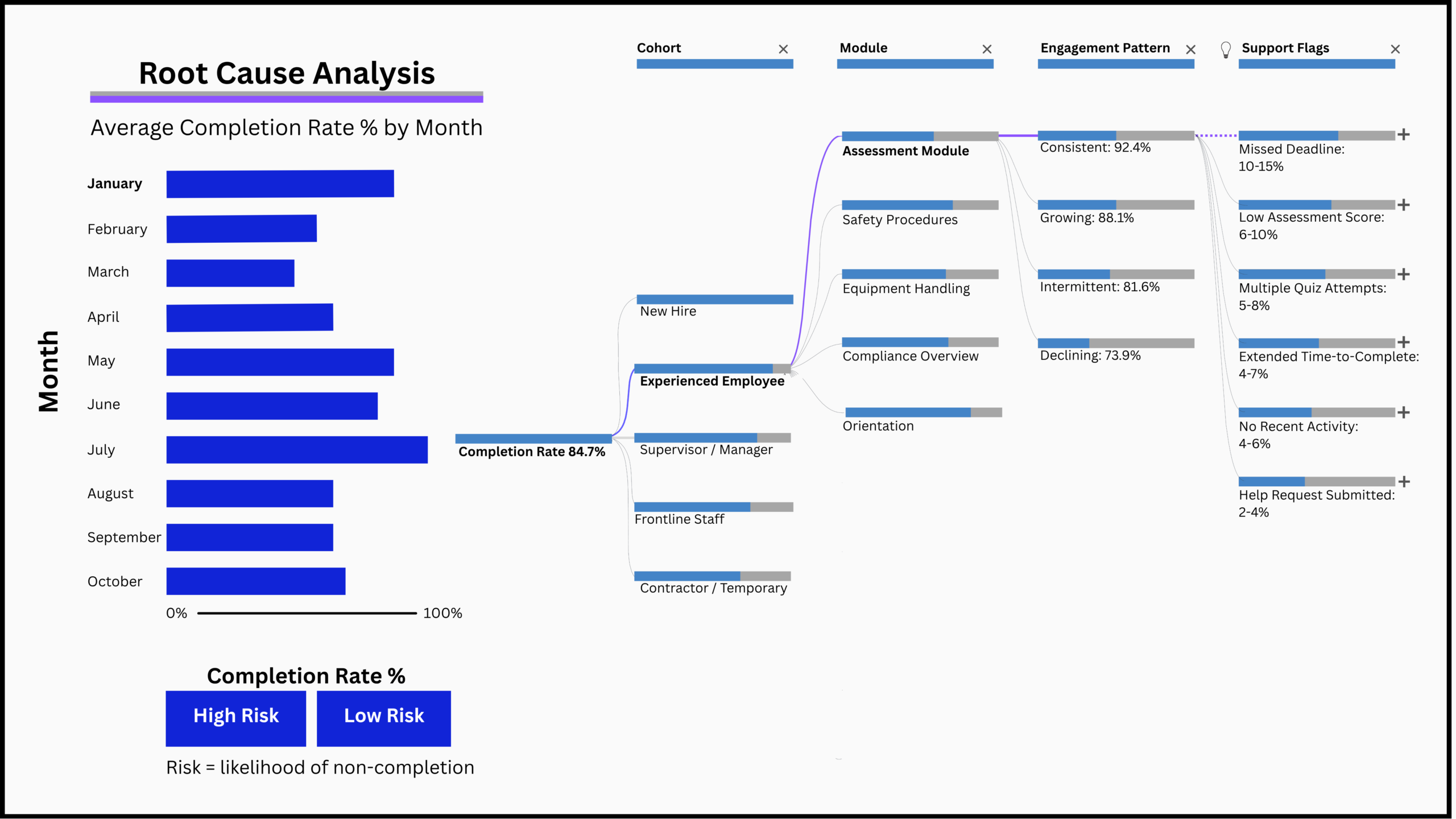
Root Cause Analysis combines completion trends with decomposition trees to trace performance drops back to specific cohorts, modules, and engagement patterns.
Predictive Analytics

Diagrams I created to map the predictive analytics workflow: how data moves through modeling methods and translates into scoring, forecasts, and risk flags.

Modeling & Forecasting

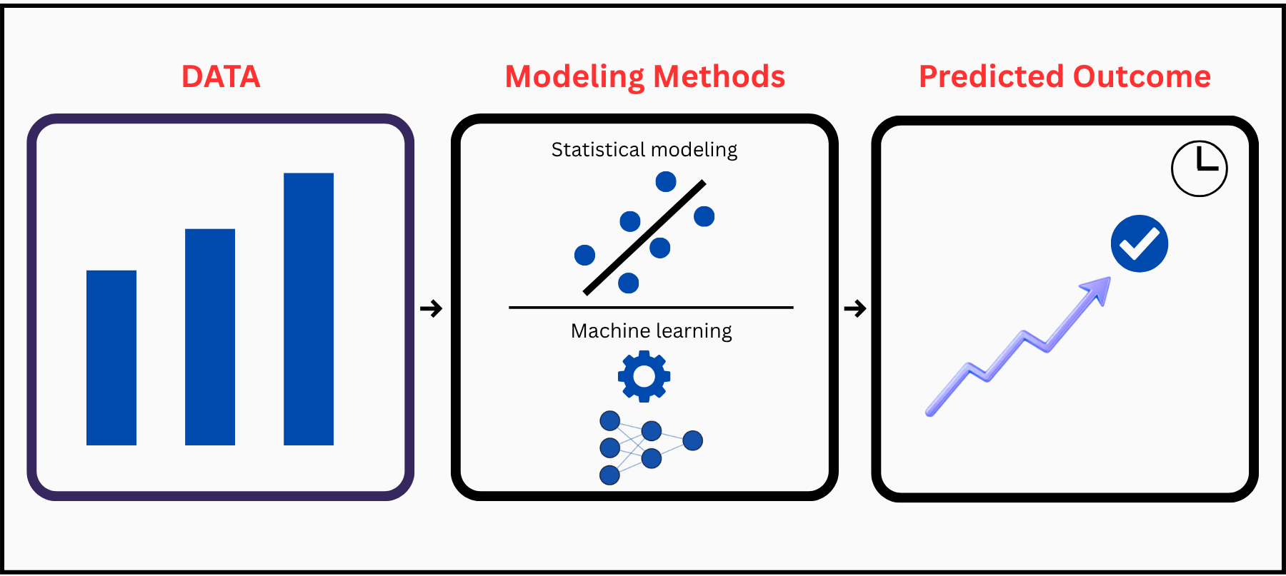
Modeling and Forecasting illustrates how historical data flows through statistical and machine learning methods to generate predicted outcomes.

Predictive Outputs

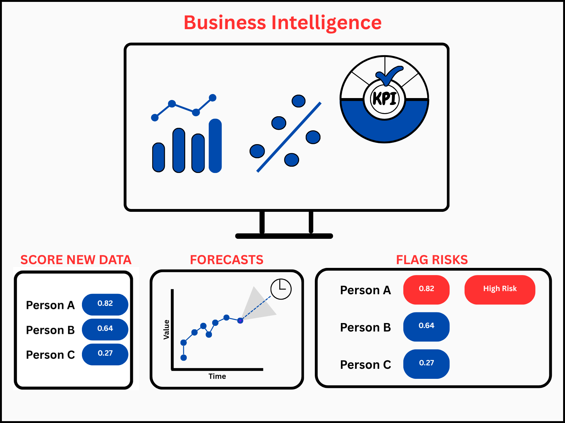
Predictive Outputs shows three ways models deliver value: scoring new learners, forecasting future trends, and flagging at risk individuals for early intervention.

Prescriptive Analytics

This section will cover how prescriptive analytics recommends actions based on predictive insights and design judgment.

In Progress

Overview Video

I created this animated explainer to introduce the four analytics types and how they build on each other.